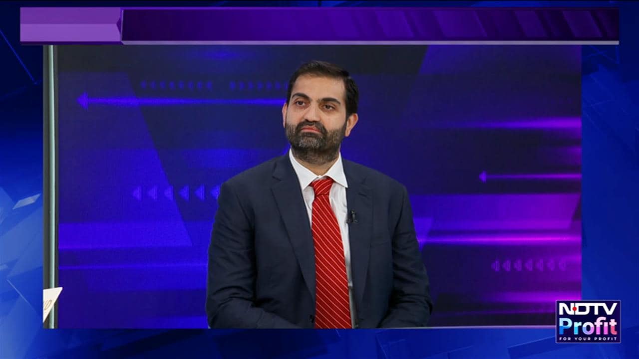
Paytm Founder and CEO Vijay Shekhar Sharma has shared his to-do list for 2024 and asked users for suggestions for the fintech app. In a post on X, he said that Paytm will undergo major AI upgrades in the upcoming year.
Sharma said that the firm is expanding AI-led customer care and personalisation using AI is under development. This comes as Paytm announced that it is laying off employees to reduce costs as the company targets turning cash-flow positive.
The company's "AI-powered automation" to drive efficiency and eliminate "repetitive tasks and roles" will result in "a slight reduction in our workforce in operations and marketing", a Paytm spokesperson told NDTV Profit.
The spokesperson didn't reveal the number of people being laid off. The Economic Times earlier reported that the company has cut 1,000 jobs. "We will be able to save 10-15% in employee costs as AI has delivered more than we expected it to," the spokesperson said.
Making my todo list for 2024. 📋
December 24, 2023
What will you like to change/ upgrade in Paytm app ? 📲
We have changed new Paytm app's Home Screen. Paytm Payments Bank and Other group entities' offerings are clearly separated now. Makes it cleaner view. ✅
Expanding AI led customer care.…Vijay Shekhar Sharma also shared that they have changed Paytm app's Home Screen and Paytm Payments Bank and Other group entities' offerings have been separated.
Responding to the CEO's post, Anurag Verma, Director of Product at Makemytrip, shared his suggestions. Take a look at few of them:
A couple of inputs design wise for the home page are - Make the sizes of the icons slightly larger and reduce the number of different background shades - will give the feel of a much more clearer UI.
Focus on user friendly copies - eg. ONDC in bottom bar would probably not be clear to most audience. Shop would probably be a much more user friendly copy.
Recurring payment flow for products like bills eg. when the user makes their first electricity bill payment ask the user to set up a recurring payment for bills in future, take any necessary permissions if required.
@vijayshekhar I have the following recommendations
December 24, 2023
1. Couple of inputs design wise for the home page are - Make the sizes of the icons slightly larger and reduce the number of different background shades - will give the feel of a much more clearer UI.
2. Mimic the natural…Another user on X wrote, "Too many notifications. Reduce that. Create opt-in/opt-out for services. PayTM scans all my SMS and sends me umpteen reminders for credit card payments which I don't want to do through PayTM. It's lead to me disliking what was once my fav app."
"I just want an option where I directly open the scanner. I'm aware about the long press option but something which is just simple," a third user wrote.
Essential Business Intelligence, Continuous LIVE TV, Sharp Market Insights, Practical Personal Finance Advice and Latest Stories — On NDTV Profit.


